Poster Challenge
Typography
Layout
Aesthetic
Summary
I participated in a month-long challenge created by @Design.Syndrome on Instagram, involving making as many posters as possible throughout the month and sharing them with his online community to gather feedback and grow as designers.
Role
Ideation, Design
Tools
Illustrator, Figma
Duration
Autumn 2023
1 Month
Design Process and Final Designs
My finalised posters in order of creation, displaying how I adapted my approach to each prompt over the course of the month and further developed my attention to detail and keen eye for aesthetics.
Each poster involved a great deal of thought, and as the challenge continued I too pushed to develop posters with more intricate visuals and thought behind them, some reflected on below.

Fear and Loathing
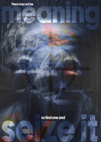
I was inspired by the feeling of self-loathing for this piece, and a tumultuous mental state. I wanted to convey the cold, harsh reality of it and how at times it can truly feel like many against one, even if it's your own mind.
I drew further inspiration from "Achilles Come Down" by Gang Of Youths, a song depicting the character of Achilles standing on a rooftop, ready to kill himself, and the vocalist trying to convince him to come down, and that his intrusive thoughts are lies. I often draw inspiration from music, with it often inspiring me throughout a project or being the basis of one.
"There may not be meaning, so find one and seize it", featured on the poster, is a direct quote from the song. Featured in smaller lettering along the sides of the poster in the top left and bottom right are two lines featured within the bridge where his mind and the vocalist are competing, his mind saying "Be done with this now and jump off the roof, Can you hear me Achilles? I'm talking to you" as the vocalist says "Be done with this now and get off the roof. Can you hear me Achilles? I'm talking to you".
I layered images of people screaming to convey anguish and anger, and combined it with a target within the middle of the page to portray danger, violence and the effects of self-loathing.
Texture
Eager to play around with the tools of Adobe Photoshop, I felt inspired by nature and the many textures and visuals found within it. I wanted to explore its beauty and intricacies and push them further to create something visually intriguing.
I chose images of leaves, mushrooms, and the wing of a bird. I felt they all shared something in common; distinctive markings and textures I could manipulate and advance visually. Through altering aspects such as brightness, contrast and gamma, I amplified the colours, lines and shapes found naturally within them.
Another aspect I explored was how I approach layout within my work. Previously I continued to follow a typical structure in regards to imagery and typography, but with this prompt I felt the need to push myself slightly and explore something I hadn't done before. This particularly worked with these images as I was able to segment and combine them to create a poster exploring varying visuals whilst preventing a clash allowing each area to stand out.
Focusing on typography, I wanted to avoid drawing away from the visuals of the poster but highlight my idea behind it; the art of nature. I chose a serif font that would stand out and align with the delicate and artful aesthetic of the poster. Using the phrasing "Explore the wonders of the world" "Let your creativity soar" drove my idea and point home, and paired with small visuals of a tree and bird brought the overall poster together.


Who? No One?
A particularly confusing prompt, it was enjoyable to deeply consider exactly how I wanted to portray it. A rather left-field direction, I looked into and curated this poster around "Depersonalisation Disorder".
Per the NHS website, Depersonalisation Disorder is catagorised as a Dissociative Disorder, which are "a range of conditions that can cause physical and psychological problems" and are "very short-lived, perhaps following a traumatic life event, and resolve on their own over a matter of weeks or months". Depersonalisation Disorder itself is described as being "where you have the feeling of being outside yourself and observing your actions, feelings or thoughts from a distance.".
Understand it from a personal standpoint, I focused on the idea of self and its disappearance. Using images of people, and scratches over their heads to convey the trauma and effects of the disorder, and playing around with depth of field to portray a sinking feeling, as if you are falling down a rabbit hole. I found it to be overall reminiscent of spy films, James Bond in particular.
I used gradients of black, red and pink to portray the feelings of danger, violence, anger and passion. In regards to typography, I used the same font and copy twice to amplify the message, and set the lower title alongside a technical definition of Depersonalisation Disorder and how it affects a person.
Momentum
One of the earlier prompts, I drew inspiration from many other designers and creatives taking part in the challenge and explored how they utilised typography visually to convey messages and draw attention.
Given the prompt, I truly wanted to visualise movement. Using Adobe Illustrator, I created a series of rings decreasing in size and altered their appearance using various tools to create a ripple effect and a a feeling of movement, and momentum. Turning it towards the idea of momentum in my personal life and my endeavour to improve as a designer, I placed an image of a person at the centre to highlight this and also point towards being at a cross-roads.
I used a blocky, in-your-face font to draw attention and offer differentiation from other visuals in the poster. Additionally, I chose to have it repeat in the background to further link to momentum, continuous steady movement. Finally, reflecting on my own experiences at the time and the stage I found my self in following completing my studies, I paired visuals of the sun on either side alongside the phrase "Keep moving forward, it's all we can do". Reflecting on the ideation and final design of this poster, I feel it was truly a reflection of my path and mindset at the time; a positive encouragement to keep going, to further my passion and do what I can.


Post-It Note
Arguably my favourite design throughout the challenge, I was inspired by love letters for this poster, and combined it with various experiences of love and romance through various quotes.
To create the love letter in the background, I used a calligraphic/cursive typeface and applied it to a love letter between Zelda Fitzgerald and F.Scott Fitzgerald. I then aged it by altering the text to appear scratchy and slightly destroyed as if it had been written by real ink. Then, I overlayed paper textures and altered the colour and opacity of the text to make it look like a physical letter I had brought into Adobe Photoshop.
Focusing on the varied and at times tumultuous experience of love and romance, I used a variety of quotes on post-it notes. I combined a paper texture and shadows beneath the post-it notes to further develop the physical detailing of the poster and make it seem more real.
I enjoyed making this poster most out of any as I was able to create a truly tangible poster out of nothing but textures, text and editing, and felt it was a testament to the amazing things designers and creatives can create.


